Estuary Net
E2. Our Analysis of Data
In this chapter, we provide our results from analysis data related tone
question posed in the curriculum: What is relationship between the
four variables of oxygen, salinity, temperature and depth. We used Excel
to produce the graphs below, using the tabular data that were available
on the web. Note that these data are not directly available; students
(or teachers) would need to produce a similar data set on their own, which
is not easy with Excel or with statistics software, which do not provide
easy methods of handling and manipulating large data structures.
The question which appears in the chemistry activity of the
curriculum appears as below:
-
Graph the relationship by month, week or day.
A. Dissolved Oxygen (DO) & temperature & salinity
B. Depth & temperature & salinity
C. Depth and dissolved oxygen
-
Discuss the relationship of tides, salinity, DO and temperature
We have divided our analysis into four parts (with our main results
in parentheses):
-
relationship between dissolved oxygen & temperature
& salinity
(- Dissolved oxygen varies over the course of the day: it
increases until the evening and decreases during the night because of photosynthesis.
- An increasing daily mean of water temperature is matched
bya decreasing mean of DO (and vice versa)
- Average salinity and DO also vary inversely.
-
relationship between salinity & depth
(Salinity increases with increasing depth. This is
due to the fact that with the rising tide, the proportion of saline sea
water in the rivers increases)
-
Relationship between dissolved oxygen & depth
(An increase of depth seems to increase DO level, explanation
still unclear)
-
relationship between temperature &
depth
(The relationship depends on the seasons. The temperature
of sea water is less sensitive than is river water to changes in air temperature.
In winter the sea acts as a large heat reservoir, the sea water being warmer
than the water in the shallow rivers. During rising tides, the warmer
sea water is brought into the rivers, which increases the temperature of
water in the rivers. However, river water is more quickly heated
by the sun than is sea water. Thus during the summer, the water in
the rivers is warmer than the water in the sea, and thus the temperature
of river water drops as sea water is introduced during rising tides.
Part 1: Dissolved Oxygen & Temperature
& Salinity
We first analyze the relationships between dissolved oxygen and temperature
and salinity. We expect that, based on everyday knowledge and laboratory
work in the curriculum, most students could formulate hypotheses similar
to the ones we have developed below:
-
Hypothesis 1: Due to photosynthesis, dissolved
oxygen will increase over the course of a day and decrease during the night.
-
Hypothesis 2: Increasing salinity causes decreasing
DO; decreasing salinity causes increasing DO.
-
Hypothesis 3: A similar inverse relationship
should exist with temperature: as the solubility of oxygen decreases with
higher temperature, we can conjecture that less oxygen (DO) will be found
in warm water as compared to cold water.
These hypotheses do not take into account tidal affects. The idea of the
project is to study the extent to which students can find in real data
evidence of relationships among DO, salinity and temperature which the
students first explore in laboratory activities. However as we will
see, tides have a big impact on these relationships, complicating the picture
in the data.
One way to study the various relationship between the three variables
is to plot the values of the three variables over time. Below we used three
graphs for different time spans, plotting:
-
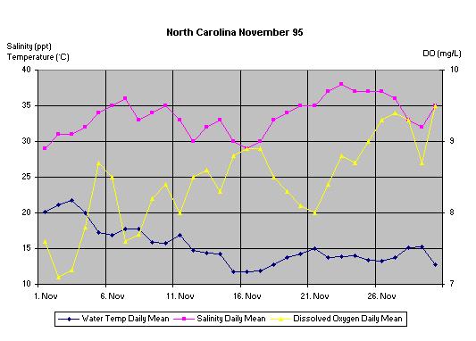
in Graph 1, daily averages for one month,
-
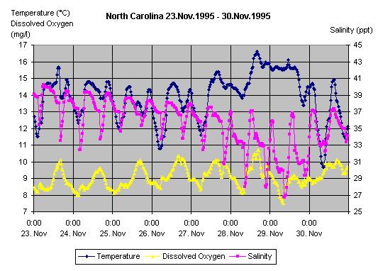
in Graph 2, 30 Minute Data plotting for one week,
-
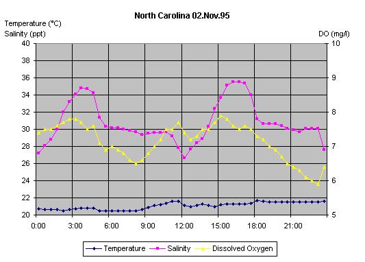
in Graph 3, 30 Minute Data for one day.
The task as presented does not prescribe the period of time students should
first analyze. We picked November 1995, because in that month relatively
few data were lost through technical problems.
Graph 1
Graph 2
Graph 3
Hypothesis 1: Daily variation of dissolved oxygen
Graph 2 (time span one week) confirms the hypothesis
concerning the daily variation of DO: we find a local minimum in the early
morning, around 3 a.m., and a local maximum in the early evening, around
6 p.m. This sort of observation is probably what the curriculum authors
expect from the students. However, with these data we can see even
more interesting details. For example, there seems to be a small
upward trend of DO from November 23rd to November 28th, followed by unusually
irregular behavior between November 29th and 30th which might be due to
some special event. Both features require further explanations.
We also note in graph 2 that the water
temperature curve shows a periodicity which is similar to, but less regular
than, the periodicity of the DO curve. This is especially apparent
after November 27th. We might describe the period after the 27th
as a continuation of the periodicity but with an increase of temperature
of about two degrees. This could be related to the daily variation of air
temperature, but we would have to explore this possibility more closely.
Looking at the location of the local maxima of water temperature, there
seems to be a shift of the local maximum from 8.30 p. m. on the 23rd to
9.30 p. m. on the 24th and so on. The minima seem
to shift as well. The maxima at night cannot be explained
by changes in air temperature which certainly are lower at night than during
the day. It is necessary to consider other variables, which we do later.
These are observations that inexperienced students may not be able to see
at first glance.
Graph 3 does not confirm our hypothesis concerning
the daily variation of DO: there is a temperature peak in the afternoon,
but we see another peak in the early morning hours which, again, may bedew
to some special event.
To see whether this is a true anomaly, we computed the mean for every
measurement period over the entire year (i.e., the mean of the 365 measurements
at 0 o'clock, 0:30, 1 o'clock, and so on).
Graph 3A: Mean DO
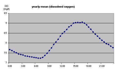
x-axis means time of the day
This graph 3A confirms our observation
of daily fluctuations in DO, and it provides a prototype of daily DO variation,
of what we might expect given no other influences.
Hypothesis 2: Relationship between salinity and
dissolved oxygen
In their laboratory work, students observe that increasing salinity results
in decreasing DO. But Graph 3 contradicts
this finding. This apparent contradiction is due to the difference between
controlled laboratory conditions (where all but one variable can be held
constant) and actual estuary conditions where there is never just one causal
variable changing at a time. However, the discrepancy diminishes
if we look at a month of daily averages of salinity and DO founding
an actual estuary, (see Graph 1.) Students
could learn much from exploring such apparent contradictions and the conditions
under which laboratory findings are valid.
Graph 1 are averages for November 1995, and to be safe, we would check
whether this pattern of daily means is found over other months and at other
sites.)
Graph 4
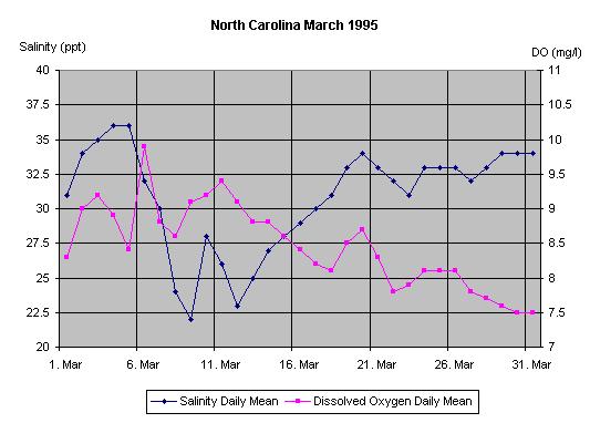
Graph 4 shows for March 1995 the daily means
of salinity and DO. The pattern of monthly variation is consistent
with that seen in Graph 1, and held up for other months and from different
locations which we checked.
It is important to discuss with students procedures and criteria for
confirming hypotheses in scientific work. In this case, we have to refine
our hypothesis with regard to estuaries: short term changes of salinity
seem to have no clear relationship to DO whereas long term changes (as
depicted by daily averages) seem to show a relationship. How could we explain
this phenomena? We know from theory and experimental laboratory work
that salinity influences the solubility of oxygen. However, that does not
mean that the actual amount of dissolved oxygen changes with changes in
salinity, only the potential the solubility changes.
Moreover, there are intervening third variables that disturb
the picture so that we cannot analyze the simple relationship between DO
and salinity. In the case of DO, we have the daytime influence of
light which fosters oxygen production, and, as we will see later, the influence
of the tides, which have a large impact on salinity.
Hypothesis 3: Relationship between temperature
and dissolved oxygen
Based on the laboratory work, we can conjecture a similar inverse relationship
between temperature and oxygen. Because the fluctuations of individual
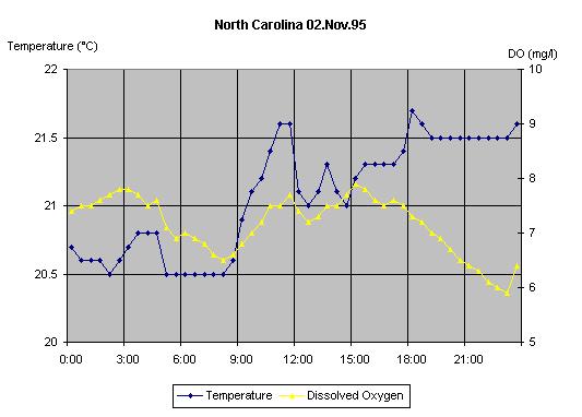
measurements of DO are hard to see in Graph 3,
we have zoomed in on the y axis and omitted salinity to create Graph
5 (still showing the relationship on November 2nd, 1995). Graph
6 shows the variation of daily means for the month of November 1995.
Again here we've zoomed in on the y axis. Looking at this month of
daily means, levels of temperature and DO fluctuate inversely and confirm
the laboratory hypothesis. This pattern is not clear, however, in the one-day
graph ( Graph 5). We have to average out effects
of other variables in order to see the theoretically derived pattern.
Graph 5
Graph 6
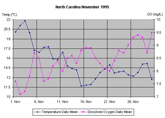
This contrast demonstrates an important aspect of data analysis which
often is ignored. In exploring the relation between variables, what we
are able to see depends not only on what relationship really exist, but
on what data we happen to look at and the way in which we look at them.
Summary of our exploration of DO, temperature, and salinity
Our analyses to this point suggest:
-
Dissolved oxygen varies in the course of a day: looking at one week
(Graph 2), the general pattern is for DO to increase
through the afternoon, then drop through the night.
-
An increasing daily mean of water temperature is paired with a decreasing
mean of DO (and vice versa) (Graph 6)
-
Average salinity and DO also vary inversely (Graph
4)
Trends in this data are not immediately recognizable. To see them,
we often had to rescale axes, aggregate data, look at different time frames.
We often found contradictory trends which sometimes required us to refine
our hypotheses or come up with alternative explanations which required
follow-up analyses. Moreover, the patterns observed in one
month or one day are not a sufficient basis for confirming general hypotheses
without systematically checking other time periods. These complexities
are the norm in scientific work, but they are unusual to find in the classroom.
When analyzing real data, however, one can hardly avoid these subtleties,
and the Estuary project does not offer much teacher support along these
lines.
Part 2: Depth & Salinity
Graph 7 shows the time series of salinity and depth
in the first ten days of November 1995. We can clearly see that salinity
and depth are roughly synchronized, their maximum to minimum fluctuating
together. This relationship is also mentioned, but not explained, in
Estuarine Ecology ((
http://inlet.geol.sc.edu/estuarine_ecology.pdf,p. 5). Our
hypothesis is that increasing water level is produced mainly by the inrush
of sea water during high tides. Therefore, salinity increases with
increasing proportion of sea water (and only incidentally with increasing
water depth.)
Graph 7
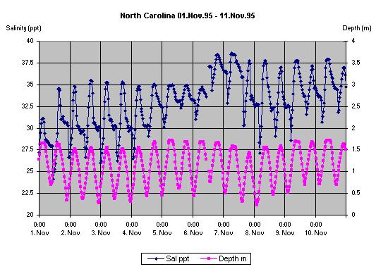
There are a number of interesting features and anomalies in the data.
For instance, we see in the depth time-series a symmetrical rise and fall
to and from each maximum. But in the salinity time-series, there
is a considerable difference in shape between the rise to each maximum
and the subsequent fall from that maximum. Moreover, the variation
of salinity between the 5th and the 7th of November is very different from
that on the other days, which could have been caused by some unusual event.
An interesting project for students would be to explore what may have caused
this anomaly through searching weather reports from the area. The
graph contains a break that is due to a missing value at that point. It
would be interesting to explore whether the missing value is related tote
beginning anomaly (maybe due to a malfunction of an instrument).
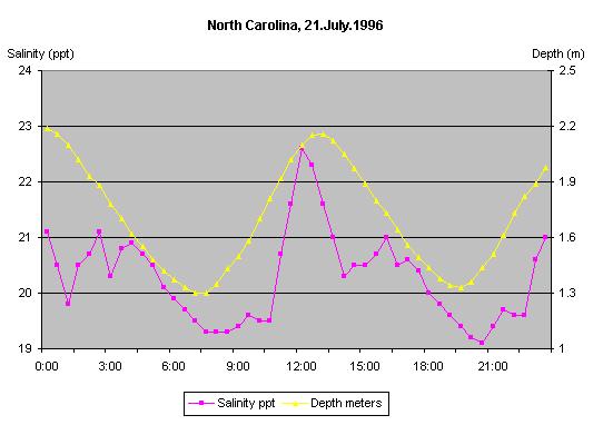
We randomly picked a day in summer to check whether we can seethe
sameco-variation. Graph 8 shows the same
overall pattern of co-variation. However, at this scale we notice irregularities
of the salinity curve including the fact that for a short periods salinity
and depth vary inversely, and that salinity is particularly erratic from
0 to 4:00. We have no idea why this could be the case.
Graph 8
Part 3: Dissolved Oxygen & Depth
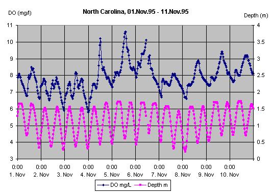
In Graph 9, we see that DO varies though out the
day (compare
Graph 3A) This
variation is due partly to photo synthesis, with the level reaching
a maximum in the midday when photosynthesis is at the highest. However,
a second daily local maxima occurs during the early morning. These
maxima seem to be closely associated with corresponding local maxima of
depth at the same time. Therefore, an increase of depth seems associated
with an increase of DO. Perhaps this can be
explained by water temperature, because the ocean water is cooler during
this time of year. This hypothesis has to be checked, however.
Graph 9
This relationship is even stronger in the Californian Tijuana River(
Graph 10). We have no reasonable explanation, and could find no discussion
of this phenomena on the project's web pages.
Graph 10

If we look at only one day, the relation between DO and depth is also
clear. We have chosen a day in summer (Graph 11a),
to confirm that this relationship exists in different seasons. The
curve on July 23rd in North Carolina shows clearly the local maxima of
DO at the times of high tides. The afternoon maximum could also result
from photosynthesis and corresponds to Graph Mean
DO. But the maximum in the night we believe is caused by the high tide.
Graph 11a

Graph 11b shows another day, where we find a
low tide in the afternoon at 15:00. In interpreting this graph, we
need to not only pay attention to the trends we see in it, but also to
compare what we see to what we would expect given no influences of the
tides. Therefore we added to the graph
the yearly mean of DO for each of the time periods (yellowline), which
should factor out the influence of the tides.
Graph 11b
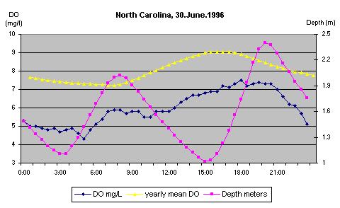
We see that the values of DO on June 30th are lower than the yearly
mean. We also observe a small maximum at 8:00 on the June 30th
DO-curve. We can see better the differences between the two curves
in Graph 11c where we've plotted the difference
between values of the the yearly mean and the DO of June 30th (the dotted
line is the average difference between the two curves).
Graph 11c
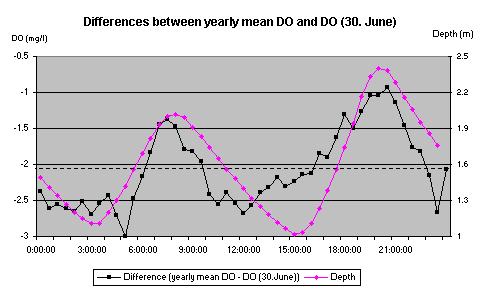
This graph shows a very close relationship between the differences and
the depth. At low tides the differences are lower than the average
difference, at high tides the differences are higher than the average difference.
This further supports the conclusion that high tides increase the
value of DO and low tides decrease it. Here again we see that isolating
various influence on real data is a challenge; students new to the topic,
and to data analysis, are unlikely to be able to do this without a high
level of support. Yet if instead students are encouraged to do rudimentary
analyses, they are unlikely to find in the real data the sorts of relationships
they come to expect from their lab activities.
Part 4: Temperature & Depth
We explore here a question we raised above, of how we could explain the
variation of water temperature over a day, particularly the maxima observed
at night when air temperature is low.
Graph 12 shows the water temperature and the
variation of depth during the last week in November 1995.
Graph 12
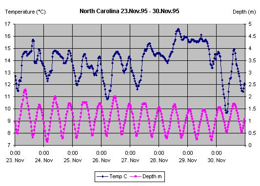
We see a striking relationship: the higher the water level, the higher
the water temperature. Perhaps surprisingly, this relationship is
not the same in other periods of the year. Graph 13
plots the same variables during a week in July:
Graph 13

We observe that morning low tide (5:00 - 6:30 a.m.) is related to a
minimum in temperature, whereas low tide during the day is related to a
high local maximum in temperature. On the other hand, high tide is
always related to a local minimum of water temperature.
Thus, the relationship between temperature and depth seems to be different
for different seasons. This is a real new finding. We have to check however
whether this is generally true and not only in this case.
The curriculum does not provide any explanation for these possible dependencies.
We conjecture that the temperature of sea water is less sensitive than
is river water to changes in air temperature. In winter the sea acts
as a large heat reservoir, the sea water being warmer than the water in
the shallow rivers. During rising tides, the warmer sea water is
brought into the rivers, which increases the temperature of water in the
rivers. However, river water is more quickly heated by the sun than
is sea water. Thus during the summer, the water in the rivers is
warmer than the water in these a, and thus the temperature of river water
drops as sea water is introduced during rising tides.
This complexrelationship does not explain the morning minimums in
water temperature. But the daily variation of air temperature may explain
them: without tides we would expect water temperature to increase during
the day due to sun radiation and then to decrease from sunset until sunrise.
Graph 14 shows a model of our explanationas
a black line superimposed on Graph 13.
We produced the line a freehand drawing capability in Excel; the line is
not based on calculations, but is an intuitive model of what we'd expect
given the above explanation.
Graph 14
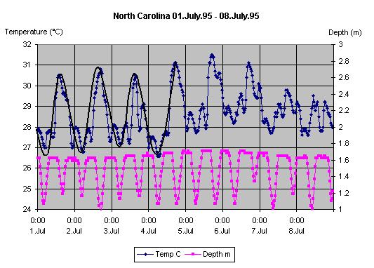
It looks as if the pattern of the temperature curve fits our invented
curve and the minima which are produced by the high tides. We could confirm
this conjecture if we had access to air temperature data for these days.
The variation of water temperature in these data is extremely interesting
but also quite complicated. We would not expect the average student,
nor teacher, to be able to manage this complexity without considerable
support. And to do it would require considerably more classroom time
that the curriculum guidelines suggest.
Summary
Our analyses suggest that it is possible, with some work and expertise,
to separate the circumstances that influence the different variables in
this unit. The students would need a lot of help from the teacher, and
the teacher probably would need a lot of help from the curriculum authors.
Another possibility approach to this unit would be to have the students
make a theoretical model before they look at data, based on what they've
done in the labs. In this model, the different variations could
be modeled with simple sine curves, which could be superimposed with a
Computer Algebra System. Afterwards the students could compare the real
data with their model . Such more refined expectations
may help them to better identify the major signals in the noise. This pedagogical
hypothesis however has to be tested in future teaching experiments.