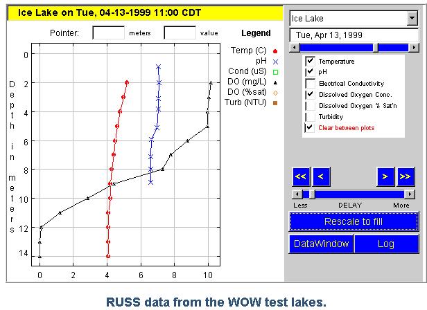
If you pressed the button "data window" you would get a data table of the used data in a separate window. The difference between the profile plotter and the color mapper is in the way the measurement data are presented. The profile plotter represents all measurement series by line plots, and it supports visualization of all six variables dependent on the depth. Displaying all six variables can often be a problem because the x-axis contains only one scaling, with is automatically chosen. We illustrate this problem with the following graphs:
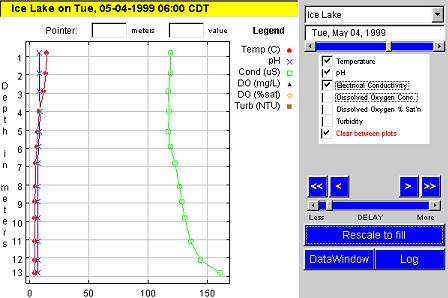
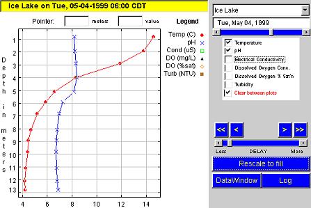
Both graphs show the two variables pH and temperature on May 4th 1999
at 6 a. m. The first graph also contains the variable conductivity. We
can clearly see that the first graph is not adequate to show the variation
of pH and temperature alone. In other words, the profile plotter
should only be used to display variables with more or less the same range
of values. (Other data analysis tools support different scales on the x-axis.)
The color mapper avoids this problem. It supports the display of two
variables, one of them as a line plot and the other by means of a color
map where the coordinate system is colored according to the measurement
of this variable. The legend above
the coordinate system shows the color code.

To understand this display we have to be aware that we have only eleven values and not a value for each depth.
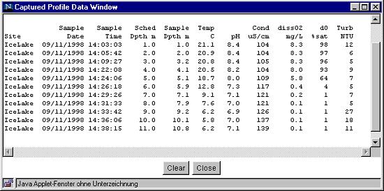
(Data can be retrieved by "Capture this Data" and "Show Captured Data")
On the basis of these data we could draw some horizontal colored lines in the graph, for instance an orange line at a level of five meters (18.7 °C) and a green line at a level of six meters (12.8 °C). The colors in between do not correspond to any measurement. Obviously the color mapper has some built-in smoothing and interpolating algorithm that generates this color, which perhaps needs to be explained to the students if they are to understand the plots.
To analyze the changes over several days or weeks, it would be useful if we could produce a slide show with measurements for a particular time of a day, for example, for two o'clock in the afternoon, and compare the various days and weeks on the bases of this point in time. This is not possible with the profile plotter. The color mapper, however, is the first step in this direction. It allows the user to select measurements, for instance only every fourth or sixth in a series. If we had six measurements per day and per lake for really EVERY day picking out every sixth measurement would be equivalent to selecting a measurement for every day at a fixed time. However, if a measurement is missing, for instance, if we have only five instead of six measurements for a day, the time of the day shifts accordingly if we formally take every sixths measurement. In other words, the available data structure is not yet optimally suited to analyzing such developments, because "missing values" are not sufficiently sensible treated. Moreover it is also not possible to display measurements of different lakes in one plot, making comparison of lakes more difficult.
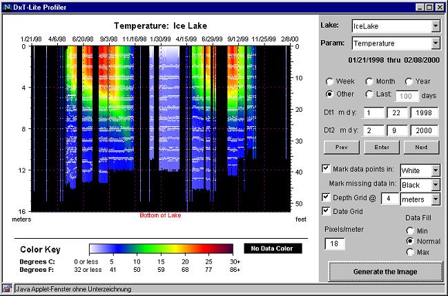
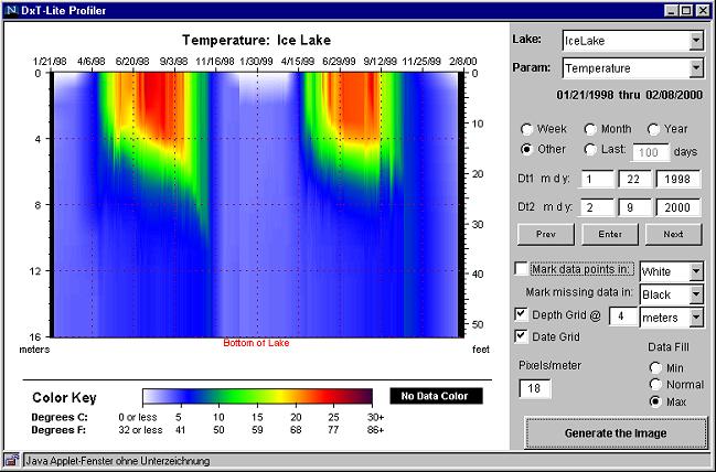
The graph above shows the temperatures of Ice Lake for the entire period the RUSS Unit has been in operation (January 1998 to February 2000). The white points show when and where measurements were taken. The color of these sampled data points can be chosen by the user, and can be suppressed as well. Depth values are interpolated as with the color mapper. Moreover, interpolation from right to left can be switched on by the option "data fill max". Below is a graph where the option "mark data points" was switched off. We see a continuous picture that was generated from a set of discrete data points by the built in algorithms of the tool.
Filling in data points in this way seems a reasonable and helpful thing
to do for short time periods. However, it is a rather dangerous thing to
do over longer time periods. For example, looking at the graph DxT-Profiler
1, we see that we have no measurements between November 1st and January
27th, 2000. Nevertheless, this three month period will be filled in in
the second graph above. Also interpolating across depths is not always
reasonable. The measurements in the graph DxT profiler 1 show that water
depth varies between 10 and 15 meters. The Lake is deeper in spring than
in winter and summer. This information gets lost if we use the option "data
fill max", and one could get the idea that the Lake is always 16 meters
deep.
These reservations aside, this tool gives us very useful information.
Scanning the graphs vertically, we see how temperature varies with
depth at a particular point in time; scanning the graphs horizontally,
we see how temperature varies over time at a fixed depth.
We can also look at a particular color (temperature) and see it "moving"
over space and time. For example, in DxT-Profiler
2 we see a green band at the left of the graph, representing water
at about twelve degrees Celsius. At the beginning of May 1998,
this water is located at between 3.5 to 5.5 meters. In the course of the
summer, this layer goes further to the bottom and is between 6 and 8 meters
in October.
As powerful as these displays are, we expect many students will need
considerable support to learn to interpret them, as they may never have
encountered plots like these before.
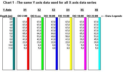
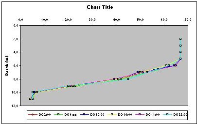
With the spreadsheets, it is also easy to examine the changes in one variable during the week. You just have to copy the values of the different days into the columns. By the same technique, you can compare two or more different lakes.